When you imagine the typical layout of a website, what do you visualise? A few key components are likely to come to mind, such as a logo positioned somewhere towards the top of a page, a navigation bar and potentially even a sidebar. But what is a sidebar on a website?
A sidebar is essentially a column of information placed on the left or right-hand side of a website. It might include pictures and links to recent blog posts, news updates, social media content, or even a contact form enticing customers to sign up for a newsletter.
Used correctly, a sidebar can be a valuable tool for improving user experience on your site. It can help visitors to navigate your content, and improve your chances of generating leads.
Here’s everything you need to know about sidebars.
What is a Sidebar? The Basics
A sidebar is simply a column of information placed on one side of your website’s pages. Commonly, sidebars are used to display “supplementary” information. For instance, on your blog page, your sidebar might include a list of recent posts, as well as a search function.
On a product page, a sidebar could include navigational links to other site pages. Some of the most popular websites in the world have their own dedicated sidebars.
Wikipedia pages feature sidebars on the right and left-hand side of the page. The sidebar on the right provides information relevant to the topic being researched, while the sidebar on the left helps with navigation, and allows users to perform actions like changing the language of the content:
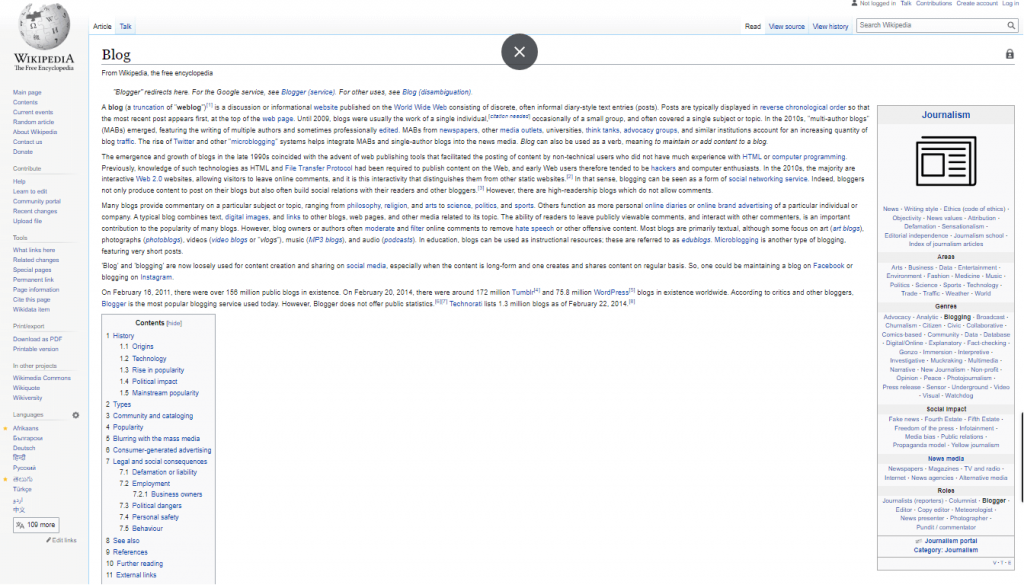
Primarily, sidebars are a component of UI/UX design for websites.
They help users to navigate your website more easily, and ensure you can convey crucial information to your target audience, such as call-to-action buttons and forms.
Sidebars: Should They Be on the Left, or Right?
One of the biggest challenges companies face when creating their blogs or websites, is deciding where to place certain website components. Depending on the type of site builder you choose, you’ll usually have the option to place your sidebars on the left or right-hand side of the page.
There’s no real answer to which option is best here. The right choice really depends on your audience and your design preferences.
Some people argue sidebars work best on the right of the page for blogs, because most people read from left to right. Naturally, we tend to look at the top right corner of a page before we scroll down through the rest of the content.
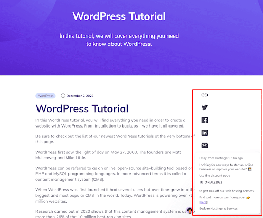
However, if you’re creating an ecommerce site, it might make more sense to place your sidebar on the left of the page. This is because most people expect to see categories, tags and other links on the left when shopping, while product options and information appear on the right.
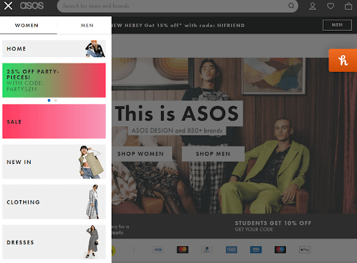
The best strategy for your site may vary, so it could be a good idea to do some basic testing before you commit to a specific placement for your sidebar.
Try running an A/B test on your WordPress site, to see whether you get more conversions and clicks when your sidebar is on the left or right hand of the page.
How to Create a Sidebar on a WordPress Site
Most of today’s websites will have their own sidebar, designed to bring valuable information to customers as they browse through the site. Fortunately, creating a sidebar is a relatively straightforward process, particularly if you’re using a site builder like WordPress.
There are actually a few different ways you can create a sidebar for your WordPress site. The first, and perhaps easiest option, is to use the block editor included with all WordPress sites in version 5.9 or above. To open a sidebar block to your site, open your site editor by clicking on “Appearance” then “Site Editor”. Click on the “Plus” icon at the top of the page to select the “Patterns” tab:
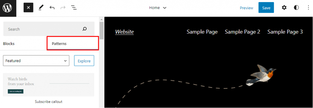
In the “Search” box, type “Sidebar” and then click the “Explore” button. This should bring up a range of sidebar pattern options to choose from. Simply select the sidebar you want to add to the page.
You can move your sidebar pattern by opening the list view on the top-left corner of the screen and finding the “Group” block for the pattern. Then drag and drop your sidebar to wherever you want it to be.
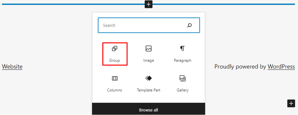
If you don’t like any of the patterns available from the WordPress block editor, you can also create your own from scratch. To do this, open the site editor and go to the page area where you want to add your “query loop” sidebar. Click on the “Plus” icon, and select “Group”:
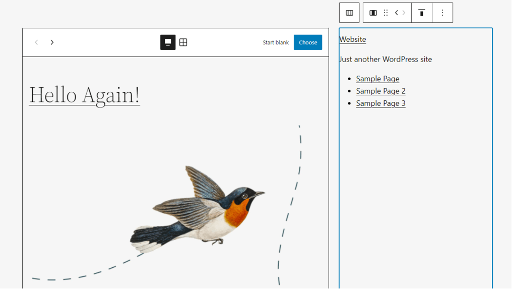
An empty group block should appear in your chosen location. Click the Plus icon again inside of the block and select “Columns”. You can choose from a range of variations. For a sidebar, the 30/70 or 70/30 column options are usually a good choice.
Once you’ve chosen your columns, you’ll see two empty columns where you can add your sidebar items, and the core components of your page.
How to Create a Sidebar Using Widgets
Another way to create your own sidebar for a WordPress website, is with widgets. If you’re not much of a technical blogger or site owner, this could be the best option for you. Widgets on WordPress allow you to rapidly add content and functionality to designated locations on your site, without code.
To access your widgets and create a sidebar, log into your WordPress dashboard, then click on “Appearance” and “Widgets”. This should bring up a list of available widgets. The widgets you can access may vary depending on the WordPress theme you’re using.
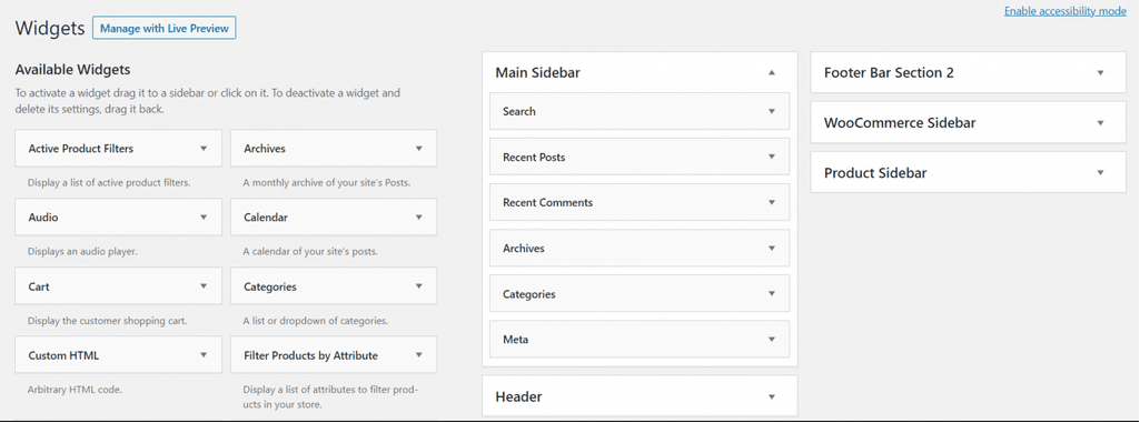
To pull a widget into your website, simply drag and drop the widget option from the left of the page into the main sidebar block on the right. You can also simply click on a widget area and expand the “location” option to add your sidebar that way.
How to Use Your Website Sidebar
Now you know what a sidebar is and you have a basic idea of how to create your own, it’s time to start thinking about how you can use sidebars effectively.
Notably, not every website needs a sidebar. If you’re creating a basic one-page website or portfolio page, a sidebar might not be necessary. However, sidebars can be an excellent choice for ecommerce websites, blogs and news sites. If you think your audience will be able to navigate your site more easily with a sidebar, it’s worth experimenting with a few designs.
Here are some practical ways you can use sidebars:
1. Reading recommendations
Sidebars are excellent for blogging sites, as they can give you a wonderful way to suggest which article or page your customer should read next. The longer your customers or readers spend on your website, the more likely they are to convert. Plus, if you can keep your visitors on your site for longer, this should improve your SEO ranking.
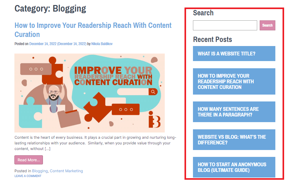
Consider using your sidebar to recommend your most recently published content to readers. You can even categorise content into different sections in your sidebar based on its theme, and include a search bar at the top of the page to help customers find the content they need.
2. Email Subscriptions
A sidebar can also be a great way to convince your visitors to turn into potential leads and long-term brand supporters. If your visitors finish reading a blog post and like what they see, a form encouraging them to sign up for your newsletter in the sidebar could make them more inclined to offer their contact details.
Place a simple newsletter subscription form in your sidebar, and make sure you don’t ask for too much information. An email address is all you really need. You should also highlight what your customers can expect from your newsletter and demonstrate your commitment to protecting their information with a privacy notice.

3. Social Media Sharing Buttons
If you’re looking to improve word of mouth marketing for your business, or you want to encourage your followers to share more of your articles, add social buttons to your sidebar. You can usually add a range of different buttons which allow users to automatically bookmark your page, share content links straight to their favourite channels, and more.
Using a set of social media sharing buttons in your sidebar can be a phenomenal tool, increasing your chances of shares, and expanding your brand reach.

4. Showcasing Social Proof
Credibility is one of the most important things you can have as a blogger, ecommerce store owner and business leader. While there are various ways you can showcase your trustworthiness, few things are more effective than social proof.
For instance, you could use your sidebar to highlight ratings from your customers, draw attention to your most recent awards and accomplishments, or just tell people how many subscribers you have on different social and online channels.

5. Sticky Sidebars
Sticky sidebars are ideal for making navigation easier on sites where you’ll be publishing longer pieces of content. Most people don’t want to scroll all the way up to the top of the page when they’re finished reading to find something new. This means they’re more likely to hit the back button if they don’t have an easy way to jump to the next stage in their journey.
A sticky sidebar stays with your user as they scroll down the page, highlighting your Call-to-Action, and any other important information your visitor might need.
Final Thoughts: Making the Most of Website Sidebars
A sidebar can be a fantastic tool for displaying additional information on your website. You can help users to quickly navigate through your posts, find related articles, or even take the next step in their customer journey with a sidebar.
Consider experimenting with your own sidebar to discover what this convenient tool could do for your conversions and growth rate.
Curious about creating a stunning logo with ease? My in-depth Looka review unveils how this innovative tool can help you design a professional brand identity in minutes.


